Australia – land of the long weekend – which means forgetting what day of the week it is.
It’s Monday, not Sunday! So this post is late (slap on the wrist for me).
This week has been fraught with many (many) distractions and much procrastination. We had some refreshing rain (the whole month’s average in two days), so my garden is finally starting to remember what colour it is supposed to be. Finally! Soon the ground will be soft enough to start digging in the autumn plantings, if the grass doesn’t take over before then.
Middle of the week brought on a bit of a health scare, culminating in blood tests and various scans. It turned out to be a fizzer (thank goodness) with pinched nerves and muscle tension being the culprit.
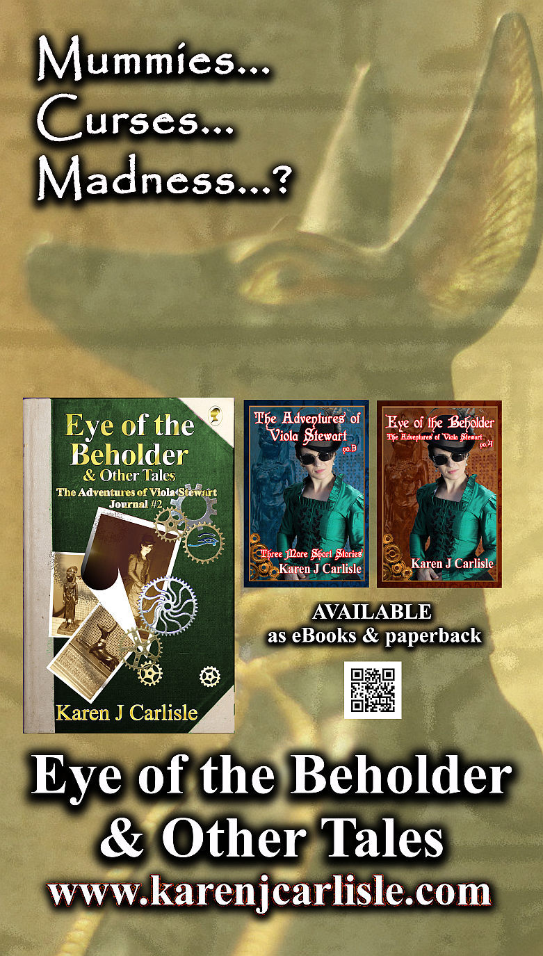
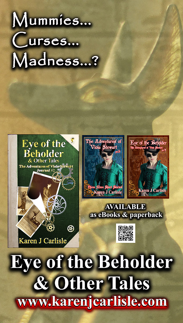
It’s a bit hard to get back into the writing grove after that, so I concentrated on business stuff (cleverly disguised as visual art, so my brain wouldn’t freak out too much). I designed a new banner for the new book set, Eye of the Beholder & Other Tales, for future events – but I can’t decide on the final one.
I’d love your opinion, dear Reader.
Which do you prefer?
I look forward to your comments.
Thanks for the comments. All good points. I’m off to do more thinking.
I just thought of an idea to get a point across with the banner – instead of the words -Eye of the Beholder & Other Tales – I would say – New Viola Stewart Books or Viola Adventures in Egypt. I hope this helps and please disregard all if I’m completely off about the point of the banner 🙂
Hi, Karen
I’ve looked at this on the Den and here. I’m confused by the three different books and I think the confusion come from not being able to read all of the titles of the smaller books. If I had not seen the books previously, I would wonder if they were all the same book with different covers. I am also questioning if the first one contains the other two especially because the third one has the same title, at least, that is all I can read of it.
I know once one works on something it is hard to see what someone would see at a glance.
Questions I would ask myself in evaluating the banner – What is the most important thing I want to get across? and What do I want the viewer of this banner do after they see it?
One last design point, the straight line of the books stops the eye and if you don’t want to change it, I would highlight the website/name in red to keep the eye moving down.